Friday, December 5, 2014

Logo Research Assignment

Logo Research Assignment


                       The Lego logo was originally created in 1934.  The logo differs from the current logo because it has color, the font is different, the size and overall shape is different. The only element that the logo kept from the 1934 logo to 1998 is that the lego letters are still all caps and it has been all caps over the years. The elements that define this logos DNA is the shape of the letters that they tried to keep throughout the years but their graphic elements really changed during 1953 overall. It fits in with the second catagory because from 1934 to 1964 the logo used 2 type faces mixed together. It fits in with the third catagory also because the logos from 1936, 1948, 1953, and 1953 all use an art element.

Monday, December 1, 2014

Logo Design Notes

Logo design and Brand identities. 


Brand- Perceived emotional corporate image as a whole it is the reputation both claimed and perceived.
Branding- a organizations brand or branding is essentially their public image. A designer can create the framework foe a brand,colors, fonts, artwork,style... but the audience completes the brand through an emotional reaction with it.

EXAMPLE- apple is an IT company that projects a humanist image, positive corporate ethics,, and support of good causes. When people use the products they connect to the brand emotionally.

Identity- Corporate identity is comprised of the visual aspects that form the brand. Close attention is paid to executing a consistant experience for the viewer

Identity Design- The corporate identity includes strict usage of colors, font families, graphic elements and other guidelines, usually detailed in a corporate identity guide. The identity can include the logo, logo variations, business cards, labels, envelopes, letterhead stationary, advertisements, tv commercials, packaging etc...

Logo- a logo is for identification. A logo is the simpalist way a company or organization can represent itself through the use of a mark or icon.
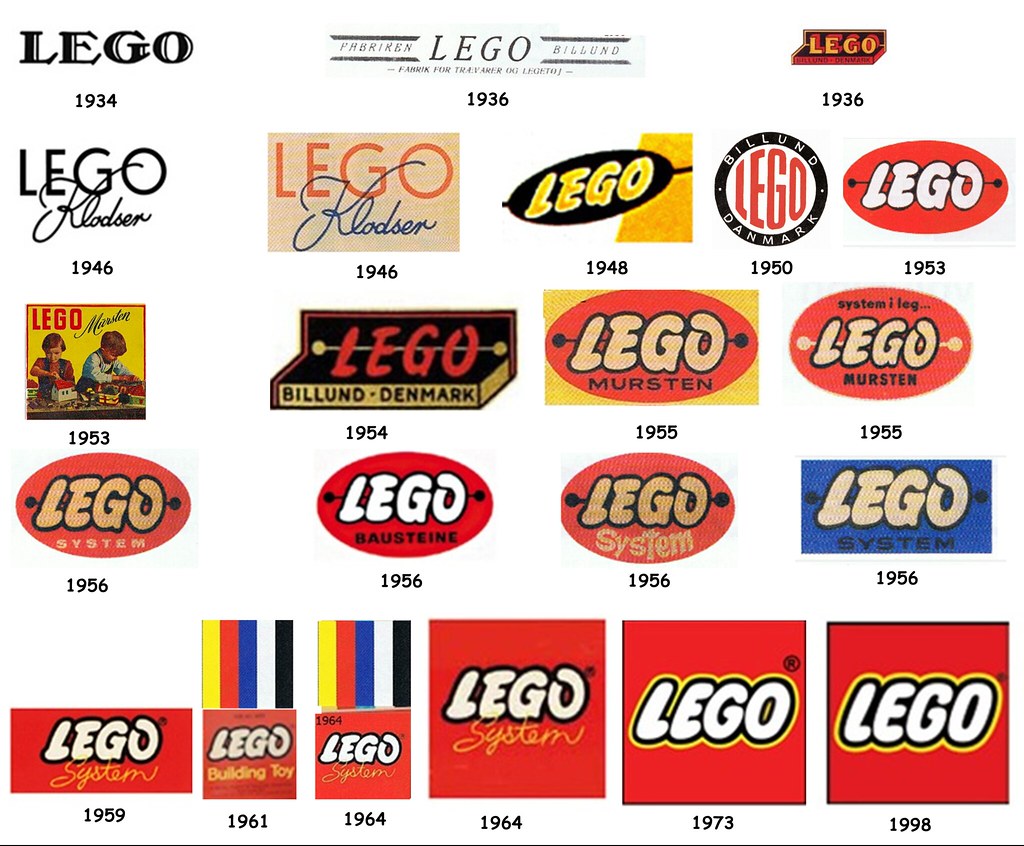
LOGO DESIGN

Why vector art- We create logos as vector art because it is flexible, powerful, and easily edited this is important when clients want to make changes. Vector art can be scaled up infinitely without losing quality.

Pencil to vector- Creating a logo design requires many phases. Many meetings and review sessions are required to arrive at design that works. Converting a simple pencil sketch to vector art requires establishing graphic style, color, line, shape and typography.

Final art- will it be sleek and technical and sedate, will it be cartoony.

Line quality- Line quality refers to the smoothness and precise nature of your lines. We use the pen tool to create perfect lines. Take your time with this part 

Line shape- If you have line art in your logo your line shape is important. Do you want an artistic look to your line.

Color- color makes a huge difference use colors that are appropriate for your design.


Wednesday, October 15, 2014

Typography Notes


Design Typography Notes


Edibility: Choose classical time tested typefaces. Make sure what you type is legible.

Fonts: Baskerville, Futura, Frutiger, Garamond, Gill Sans, Helvetica, Palatina, and Times New Roman are all good fonts to use.

Serif  V.S. Sans Serif: Serif reads best at smaller sizes, can be complimentary and is good for movies titles. book titles and business cards.

Font Variance: Too many confuse the reader. Avoid many fonts in one project.

Identification: Fonts that are too similar cause ambiguity.

Readability: Use upper and lower case letters for optimum clarity.  CAPS are equivalent to shouting and are difficult to read. Caps are good for HEADLINES, BUSINESS TITLES, or BOOK TITLES.

Alignment: Left alignment reads easiest, consider eye flow as it moves down a page and use proper color choices.

Emphasis: 1. Italics
                  2. Bold
                  3. Size
                  4. Color
                  5. Typestyle Change

Integrity and Weight: Avoid stretching or distorting type. Strive for a sense of balance.

Wednesday, September 17, 2014

Format Notes


Image compression-
                 Makes it worse and smaller in file size. Also makes it look and sound worse
DVD=Compressed video. Every document is packaged in different formats. Graphic files like photo video or artwork can be reduced in file size by compression. Compression throws away data that it doesn't need. GIFs fall under categories of compression, Lossy and Lossless.
Lossy-
      Image data is lost and can cause poor image quality and a small file size.
Lossless-
      Retains image data for higher quality but larger file size.
TIF, JPG, GIFS are the 3 most common activity's like printing, scanning, and displaying images.
PNG- Common web format that is high quality and can contain an alpha channel which makes transparencies. 
 TIF- Common format for desktop publishing, print, photo, and graphic design. Its a lossless file format and retains image data for maximum, not internet friendly. Larger file size.
JPG- Joint Photographers Export Group. Created for digital photography, and works best for photo content. Its a lossy format and the compression is adjustable.
GIF- Graphic Interchange Format. Best for graphics or images that have flat color or even tone such as a cartoon. Reduces image size by indexing color from 3 channels to 1. Adjustable by changing color bit levels from 1-8. Contains no DPI (Dots per inch) data for printing. There are also 256 color in gif.
 Tif and Jpg are best for images with pixels that blend in color these are called contiguous pixels.